
Priscilla Sekaran | Design Portfolio | Portfolio Categories Design
111
archive,tax-portfolio_category,term-design,term-111,wp-theme-stockholm,ajax_fade,page_not_loaded,,select-theme-ver-4.1,vertical_menu_enabled,wpb-js-composer js-comp-ver-5.2,vc_responsive

Archive

Xolo

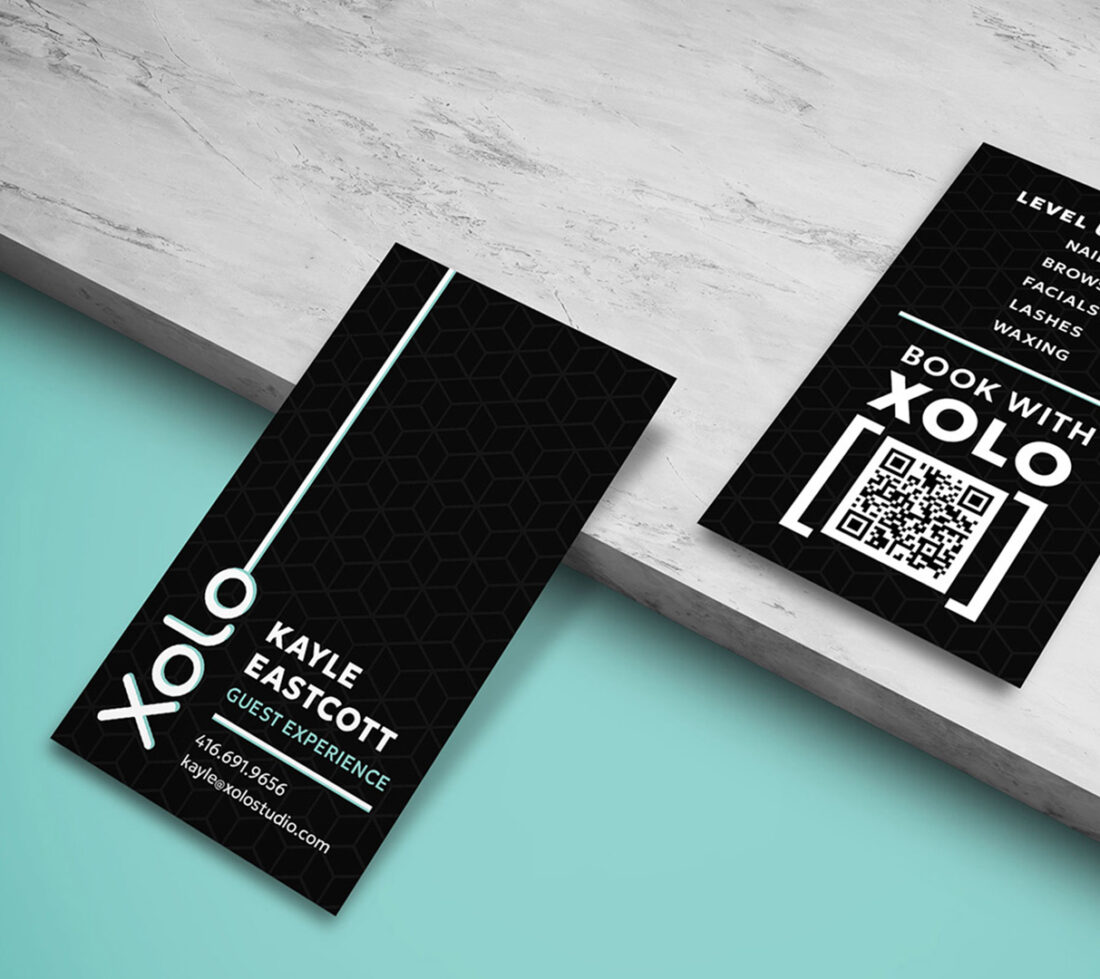
Xolo is an unconventional and creatively spirited spa and nail salon in Toronto, dedicated to glowing skin, polished grooming and beautiful, healthy nails through a scientifically grounded approach to beauty and wellness.

The redesigned business cards vividly embody Xolo’s identity through a bold monochromatic palette of black, grey and white that echoes the salon’s sleek, minimalist aesthetic while helping differentiate team members, ensuring a functional yet unified brand presence.

A geometric pattern subtly plays in the background, lending depth and mirroring visual motifs used in Xolo’s storefront and throughout the brand’s promotional marketing collateral. A charismatic splash of teal brings the design to life, channeling the spa’s quirky yet minimalist chic sensibility.

The logo’s vertical orientation reinforces Xolo’s unconventional charm, hinting at how the brand reimagines traditional beauty norms and leaves an unmistakable impression.
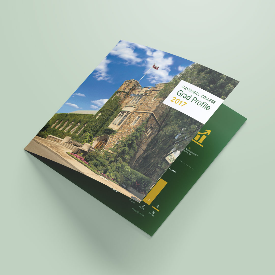
Havergal College

Havergal College is an independent boarding school for girls located in Toronto, Ontario. Created and produced various marketing and branding pieces for the College including this Grad Profile Brochure. Drawing inspiration from the existing brochure, reconfigured the layout design, graphic elements, tables, and graphs while maintaining the College’s branding and colour scheme.

Mastermind Toys

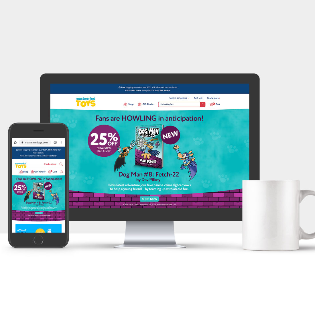
Designed numerous email campaigns for Canada’s leading specialty toy and children’s book retailer, Mastermind Toys. The campaigns prioritized the customer experience by creating fun and engaging visual stories that highlighted weekly featured products and promotions. The design concept behind this campaign was inspired by the book cover, integrating key elements, such as the main characters, colour scheme, and graphic elements by creating a fun, engaging design.

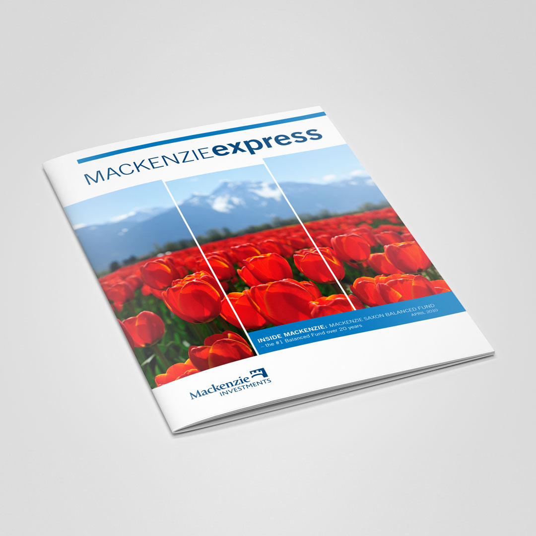
Mackenzie Express

Selected cover designs for monthly financial publication Mackenzie Express for Mackenzie Investments. 
The concept behind the cover design was to showcase vibrant, engaging natural imagery from across Canada, reflective of the season the issue was published.

Mackenzie Investments

Created the layout and design for the Education Guide at Mackenzie Investments. The design strategy was to create visual interest with the use of a fresh colour palette, dynamic layout, text composition, and radiant imagery.

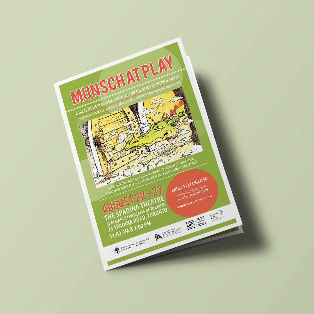
Munsch at Play

Munsch at Play is theatrical play produced by Tetrault Arts Productions and Nettel Media, based on the works of famed Canadian Children’s book author Robert Munsch. Created the design and layout of the promotional marketing collateral from concept to completion. The design was inspired by the Paperbag Princess book cover, with the use of circular graphic elements and vibrant bold colours to appeal to the target audience of young children and families.

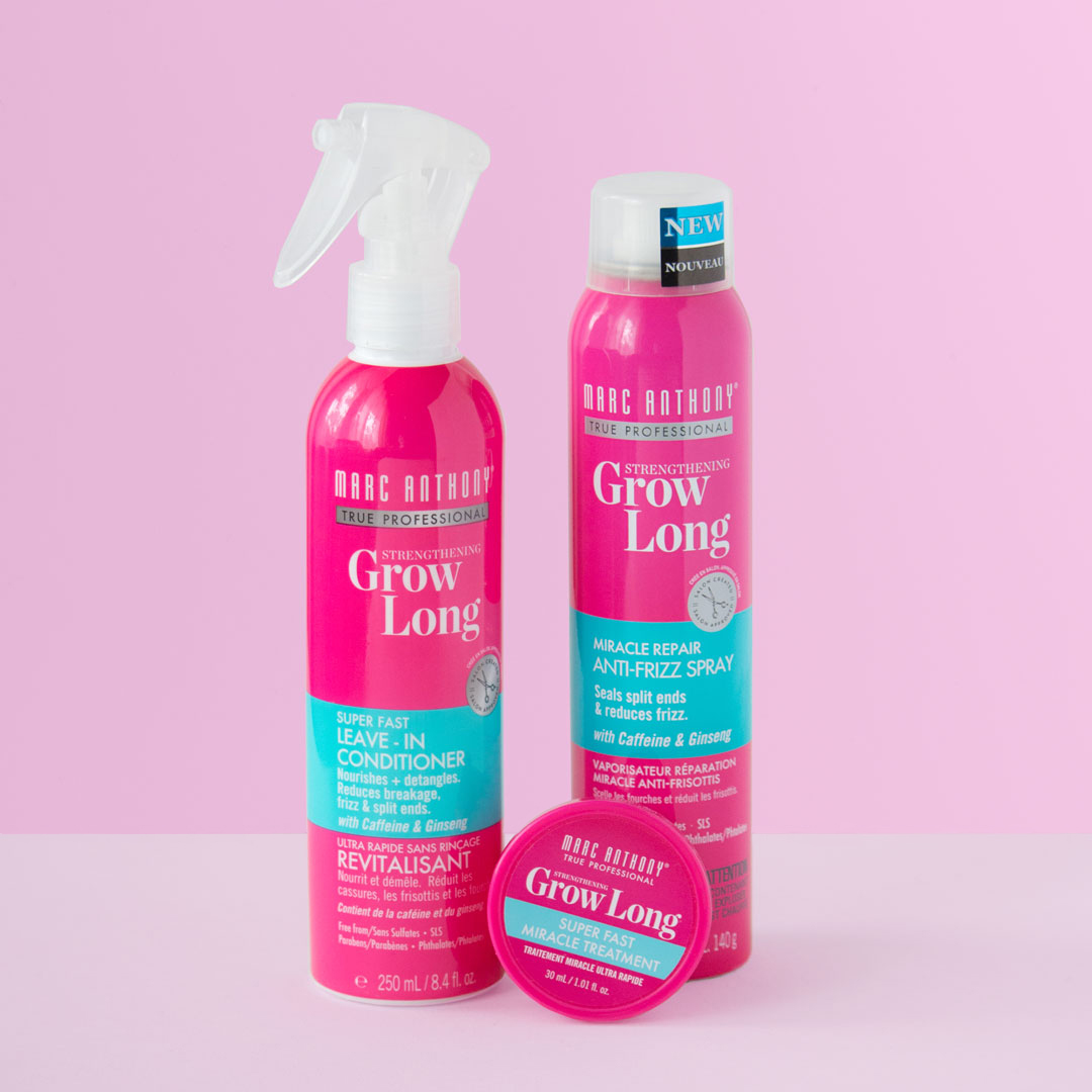
Marc Anthony Cosmetics

Created and produced a variety of packaging artwork, die lines and product labels for the hair and body care company, Marc Anthony Cosmetics including the redesigned Grow Long hair care line.

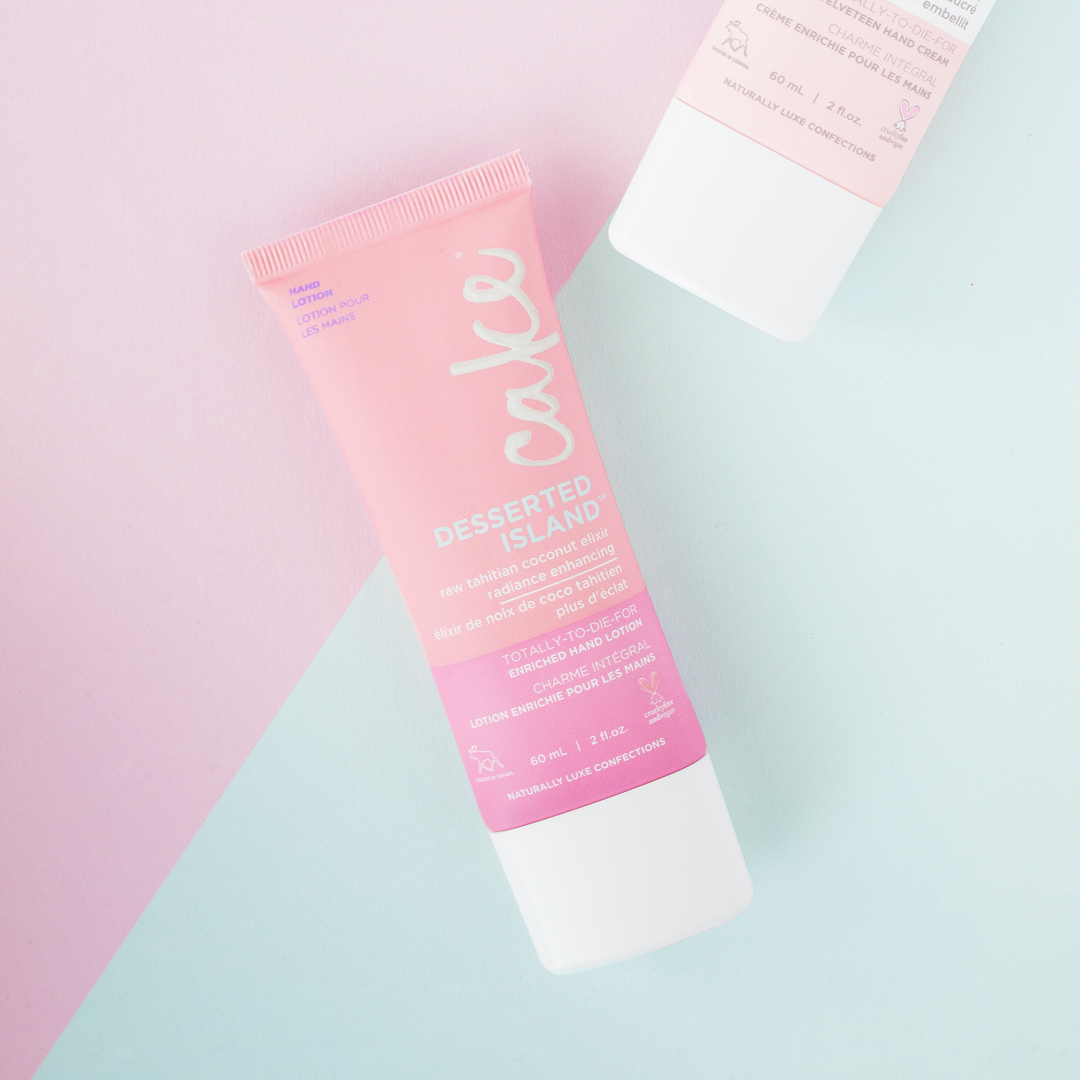
Cake Beauty

Created and produced a variety of packaging artwork, die lines, and product labels for the hair and body care company, Marc Anthony Cosmetics including the all-natural product line Cake Beauty.

Mastermind Toys

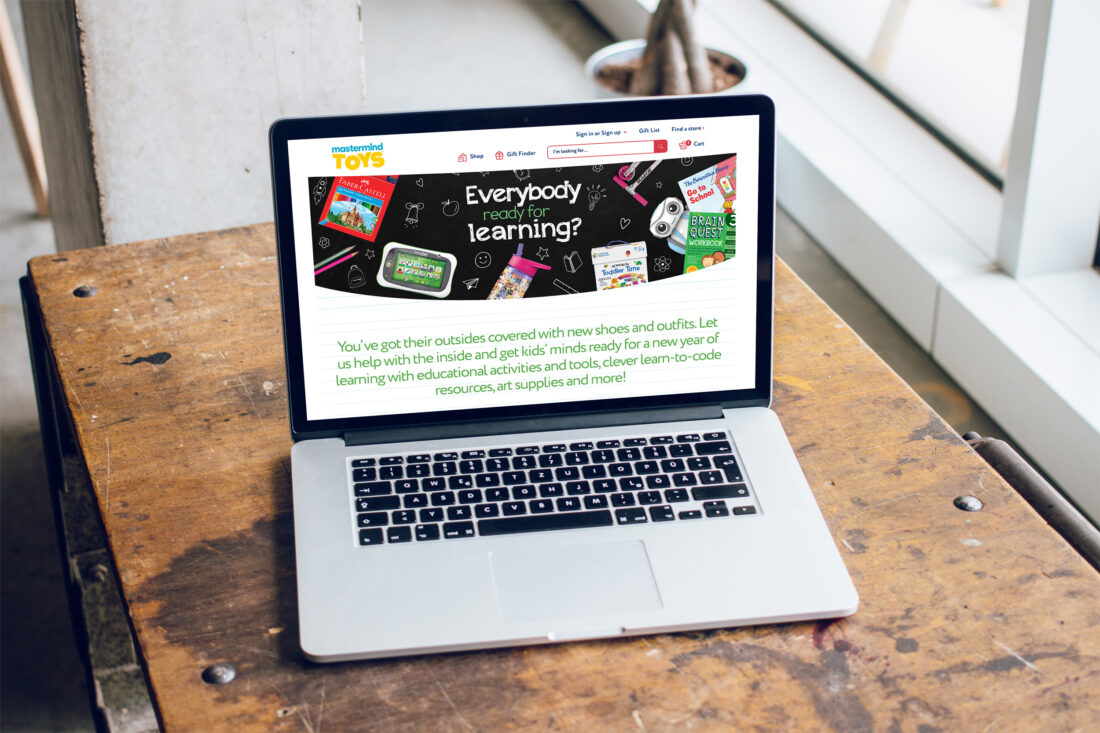
Designed numerous email campaigns for Canada’s leading specialty toy and children’s book retailer, Mastermind Toys. Created various web assets for the main website and online boutique shoppes to support digital stories from the email campaigns.
The design concept behind the Back to School campaign was to create a fun, engaging design to get children and parents excited for the Back to School season. Various school elements were featured to bring the concept to life, such as a black chalkboard and lined notebook. White chalk doodles were added alongside product images to create contrast and a playful feel on the black chalkboard. Pencil-style sketch doodles were added to look like a student’s notebook for the lined notebook. To create an even more dynamic feel, green and red accent colours were added to the design for a fun pop of colour and represent growth and learning, which also complimented the overall look and feel of the campaign.

Shangri-La Hotels & Resorts

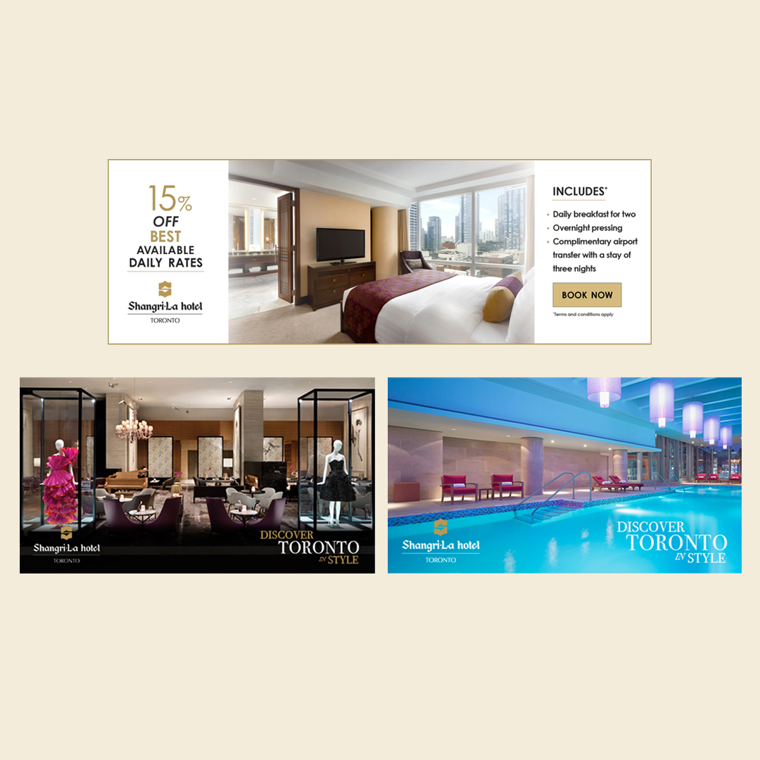
Shangri-La Hotels & Resorts is a Hong Kong-based multinational 5-star luxury hospitality company with over 100 branches worldwide in Asia, Europe, the Middle East, North America, Oceania, and Africa. The concept behind the digital ad banners was to create an attractive yet elegant design to reflect the hotel’s look and style.